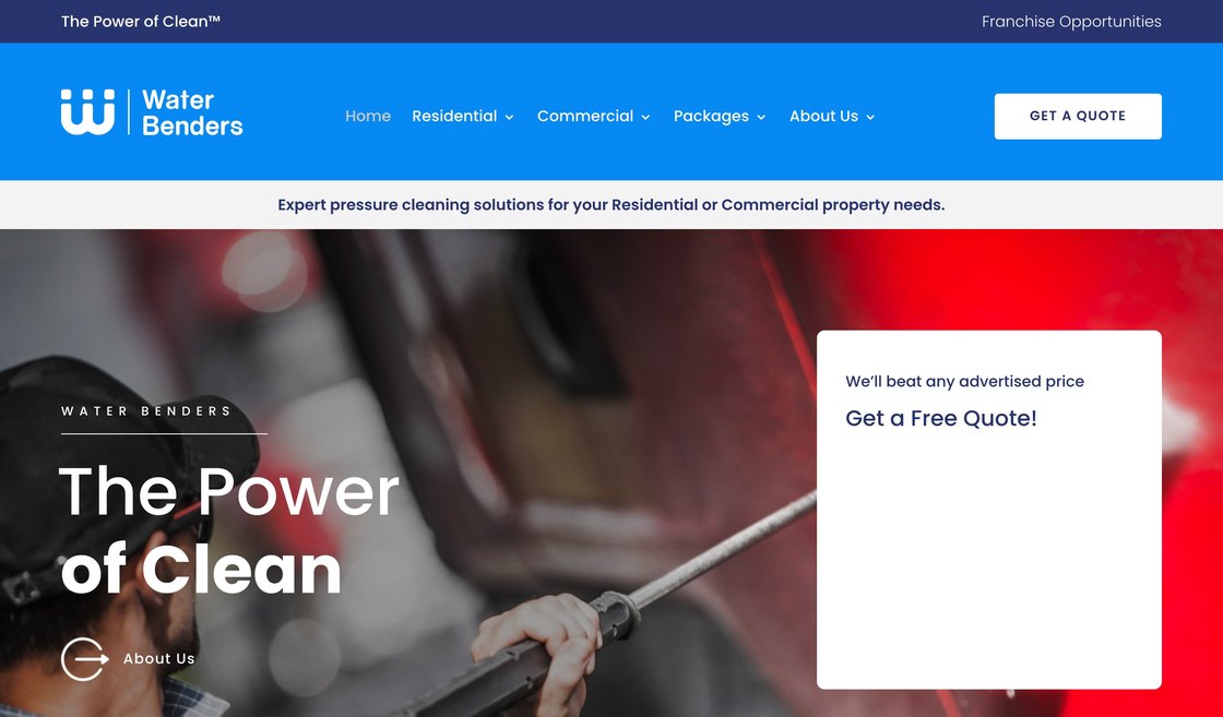
Build the product page for our own Australian peptide-protein brand — a study of directions first, then one of them built out in full, over the Shopify store it already sells on.
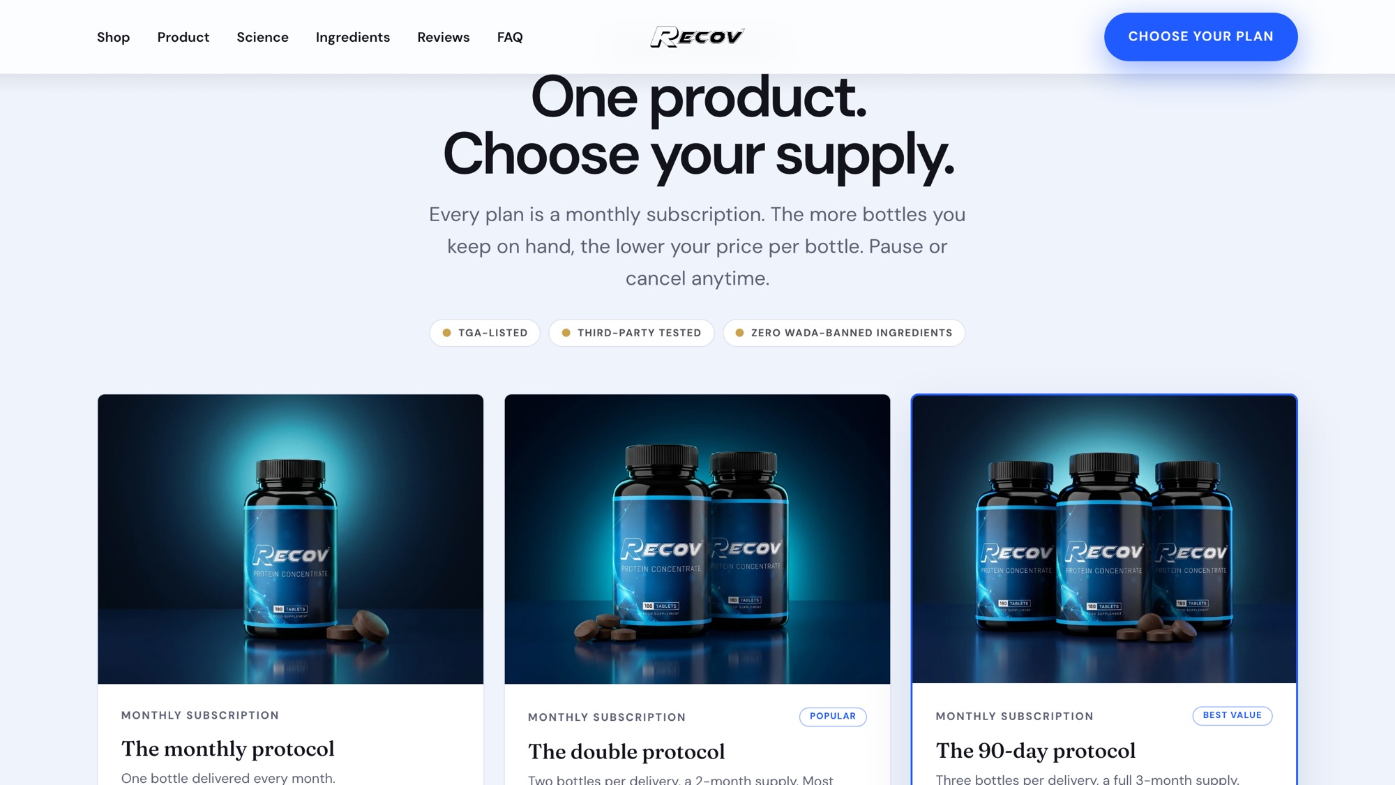
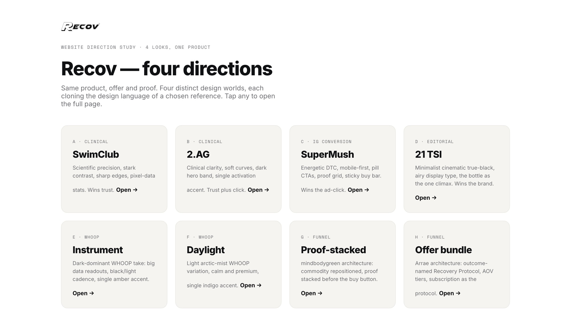
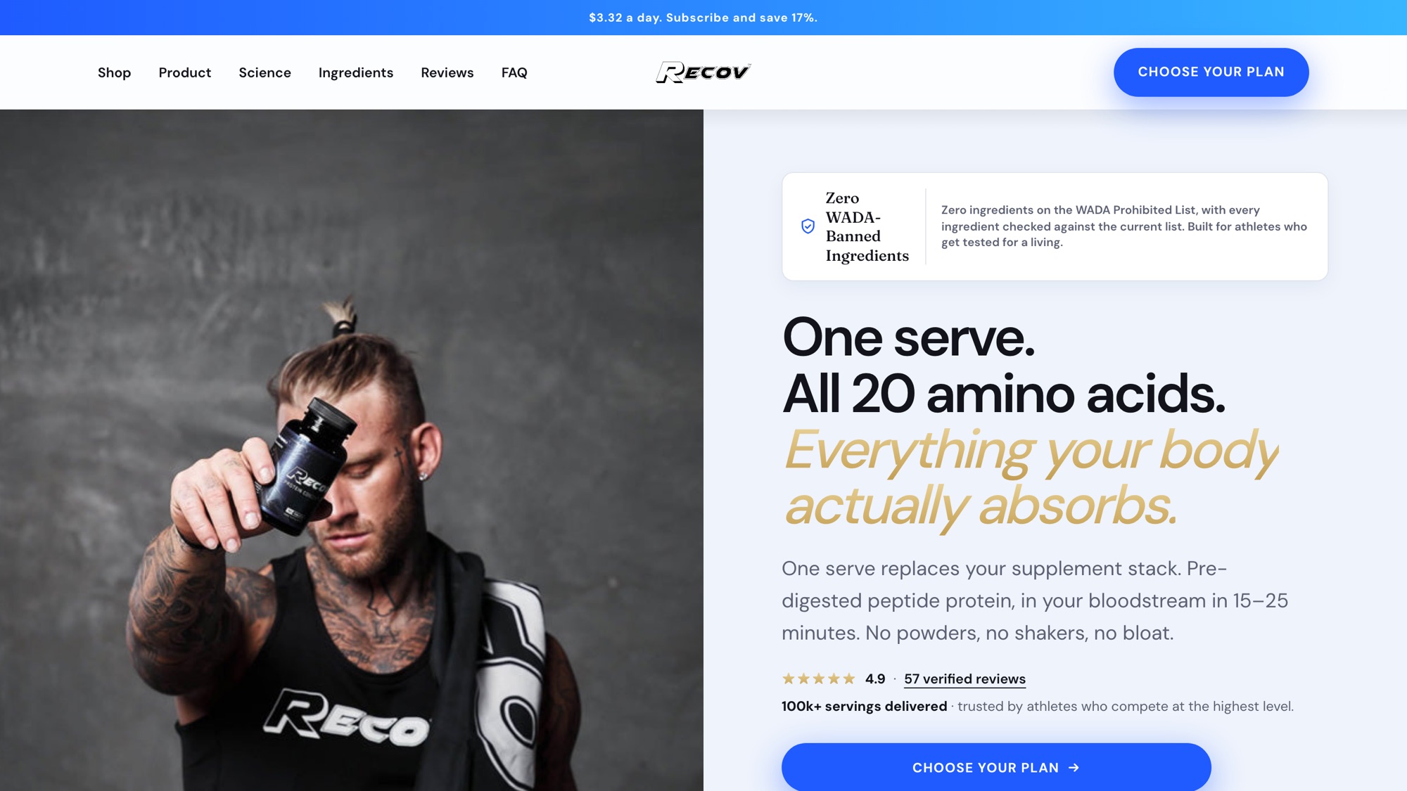
Recov is one of ours, so the sums were settled long before the brief was: at $3.32 a day the page is arguing against a shelf of tubs the reader has already paid for. What that costs you is a page that cannot open on a hero and a buy button — it has to answer the mechanism, the label and the price in the order a sceptic asks them, and still be one scroll.


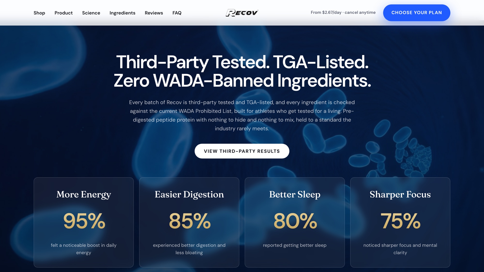
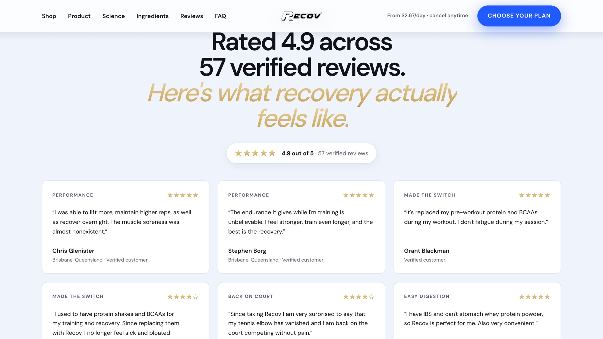
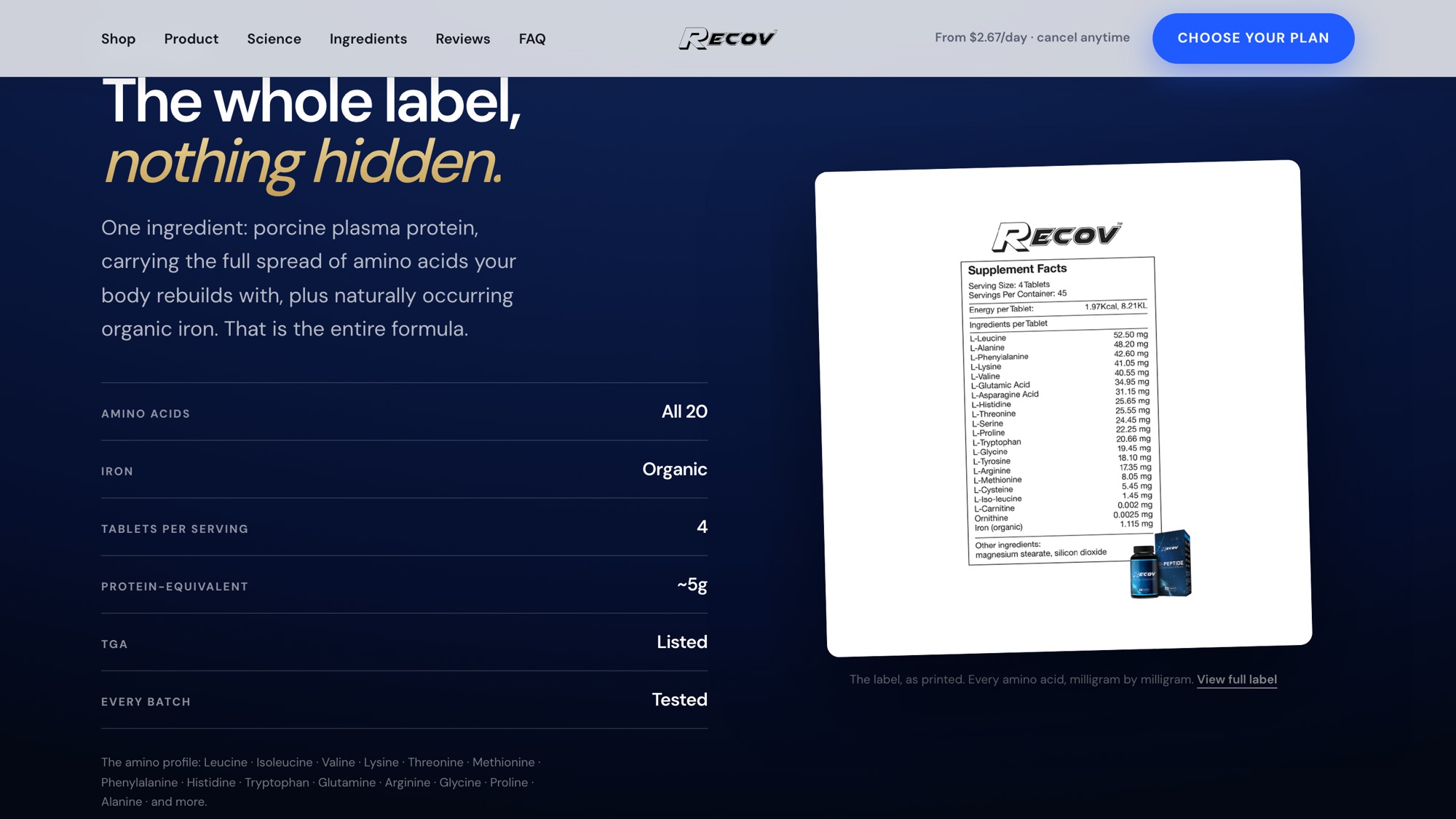
The rating is the store’s own verified reviews, not a graphic — 4.9 across 57 when these plates were shot, and the reviewer’s name and city sit under each one. The batch line is the same: third-party tested, TGA-listed, and the label panel is a photograph of the printed supplement facts rather than a redrawn table, because a redrawn table is a claim and a photograph is the label.
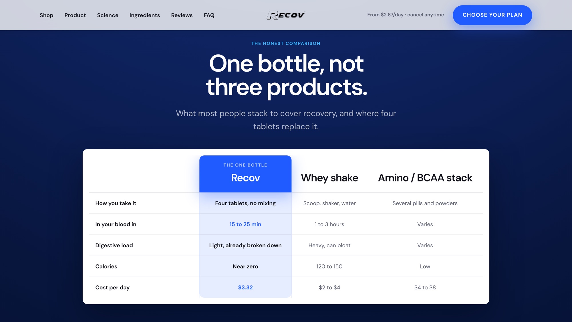
The comparison table is the argument the whole page turns on, so it is a table and not a paragraph: what four tablets do against a scoop of whey and against an amino stack, priced per day. The reader is being asked to retire two products they already own, and that is a subtraction they have to be able to check.
Same job, a different kind of shop, across the rest of our online store work.


Straight answers, no account manager, no dragging it out for months. They shipped it, then kept improving it after launch without sending an invoice for every change.
Founder

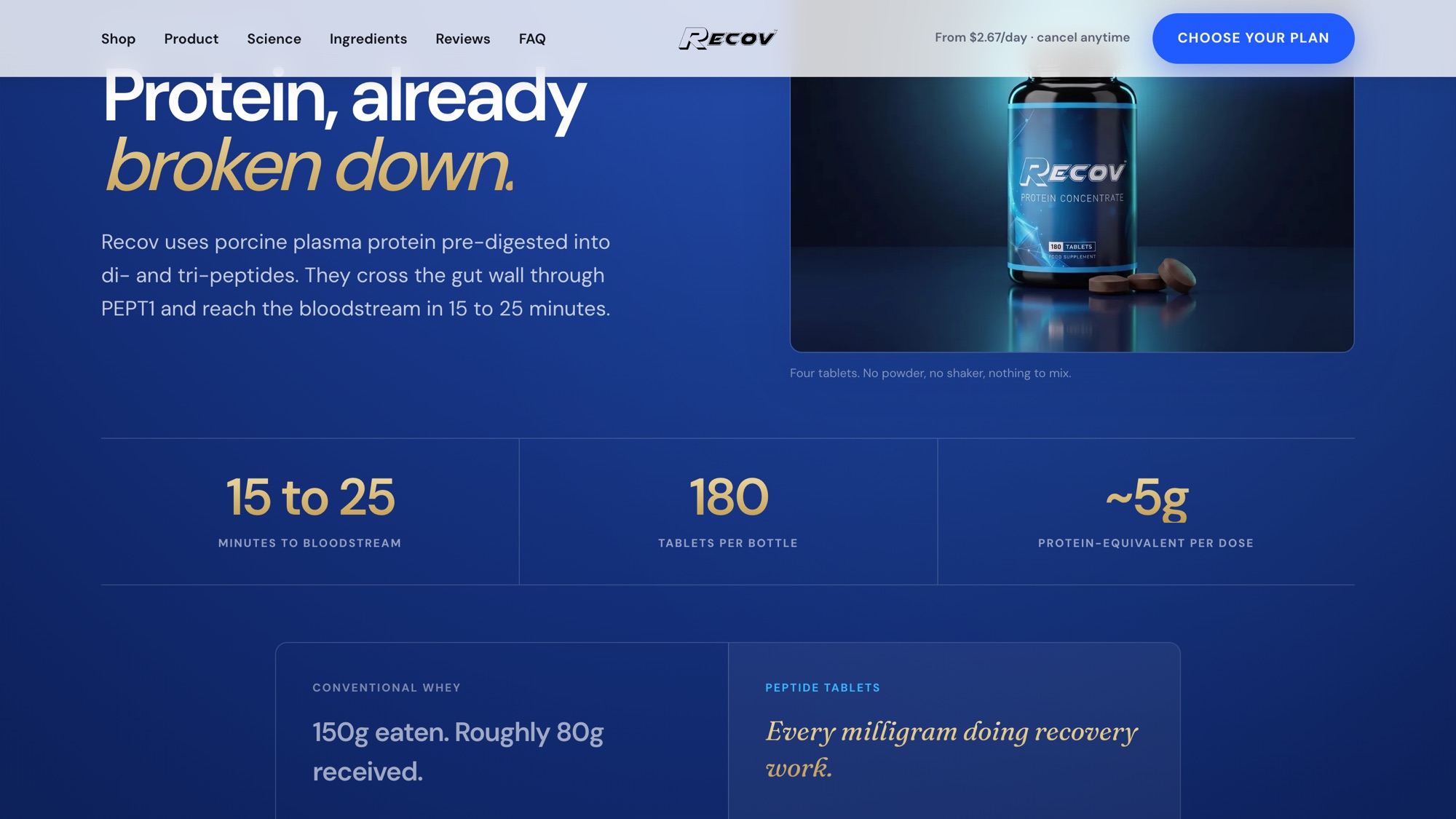
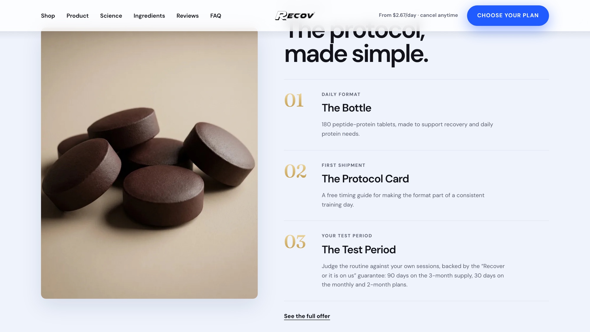
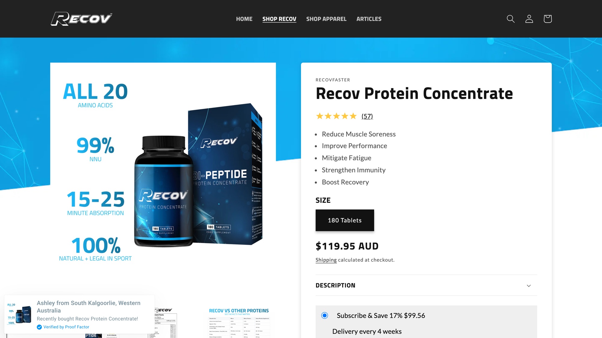
The product page recovfaster.com trades on today, and the direction that was built out in full. Drag the handle, or use the arrow keys.
Nine of them on the work page, four of those our own companies.
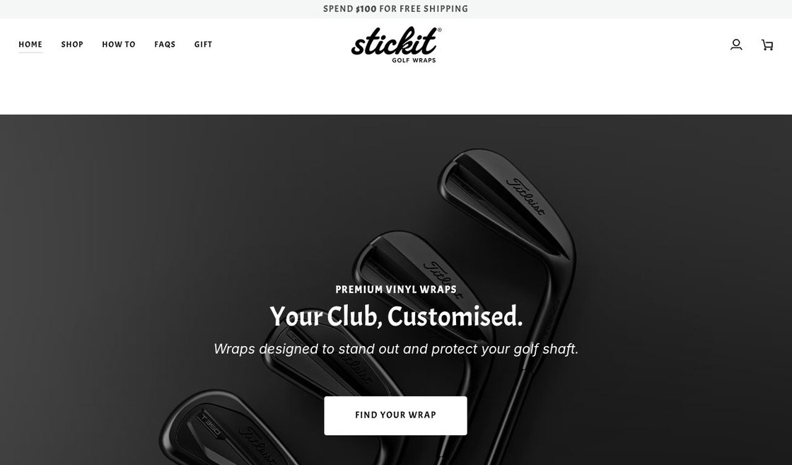
A live configurator on the store: pick a finish, pick a colour, and the club on screen wears it. Ours.
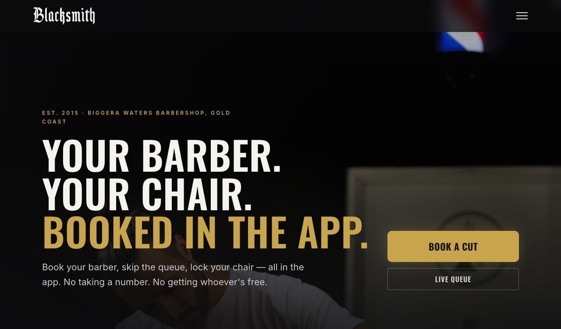
A chair-rental shop where every route ends on a named barber, including the one for people who do not have one. Ours.
Years of word of mouth with nothing to send people. Now one link closes the job. Ours.
Free 15-minute call · you talk to an owner, not a salesman · no pitch
The one on the left of the slider. recovfaster.com runs on Shopify and that page is taking the orders today; the page on the right is built and live at its own address, waiting on the brand. Recov is ours, so the queue is our own — we would rather show you the state of it than crop the comparison.
Because the argument was the settled part and the look was not. The product, the offer and the proof are identical on every one of them; what changes is the design world, each drawn against a reference we opened rather than a style we described. Choosing between built pages takes an afternoon. Arguing about a look in the abstract takes a fortnight and still ends in a guess.
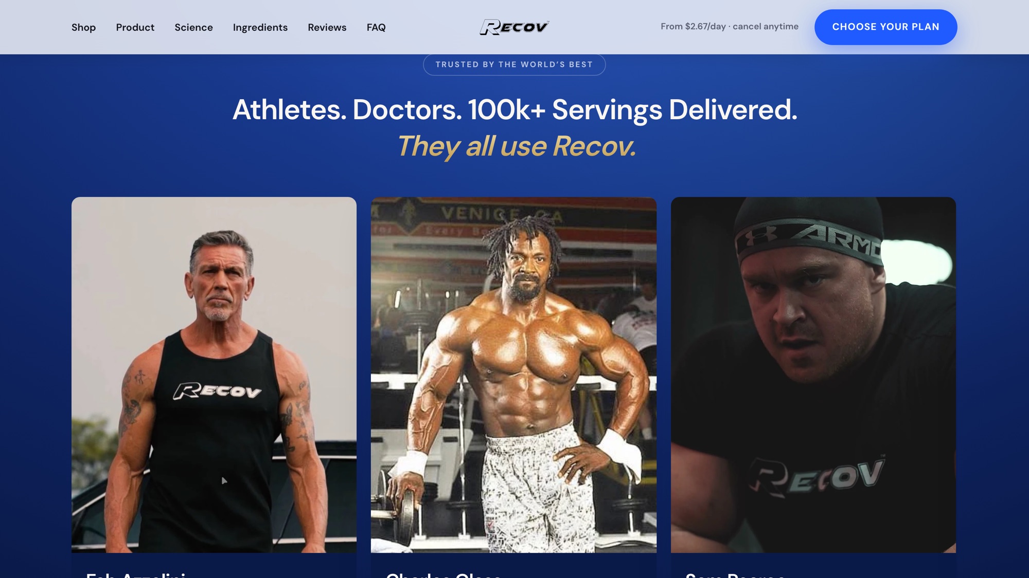
Recov’s own, and every one of them is named and credited on the page rather than captioned “athlete”. That is the test we apply to proof of any kind: if the person cannot be looked up, the picture is decoration and it comes off.
Not in the way people expect. The limit is almost never the platform, it is that the theme’s stock sections cannot say anything specific, so every store on that theme argues the same way. Online stores covers what gets built on top and what stays stock.
It stays reachable while anything still points at it — ads, emails, a printed insert — and then it redirects. Retiring a URL that still has traffic on it is how a rebuild loses the sales it was meant to win. Rebuilds and rescues covers the swap.